


This summer the University embarked on an expansive rebranding effort that it hopes will go a long way in changing the perception of St. John’s both from within and outside the school’s gates.
Administrators said the wide-ranging changes that are beginning to appear on campus this fall – including a new logo, acronym and color scheme – are the result of a recent rebranding study that began over a year ago.
With the help of Virginia-based marketing research firm Simpson Scarborough, the University surveyed between 3,000 and 4,000 people about their perceptions of various aspects of the University from academics and “prestige” to athletics, according to Dr. Hallie Sammartino, vice president of marketing and communications.
“They asked basically key questions about perceptions around St. John’s and a lot of them focused on what do you think of St. John’s today, where do you think St. John’s should go,” Sammartino said in an interview this summer.
That discussion led to a complete overhaul of the University’s outward image.
Three new logos were designed, blue was re-added to the color scheme alongside red and white, and the 10-year-old acronym of “STJ” has reverted back to the more traditional “SJU” that many alumni are already accustomed to.
The new image for the University focuses on two concepts Sammartino referred to as “St. John’s today” and “St. John’s tomorrow.”
Today focuses on the five points of a supportive environment, diversity, Vincentian values, athletics and New York City while tomorrow focuses on academic prestige without attitude, the power of a global city and world campus, success and service, New York City’s team and the inclusion of the school’s alumni network.
Sammartino also said that the focus groups and surveys showed that the general public felt that St. John’s ranked third in the New York area, behind NYU and Columbia, but ahead of Fordham and others.
She said data showed that prospective students also thought highly of the school’s academic programs, but the feeling was different within the University’s actual community of faculty, staff and students.
“We were kind of like ‘What’s the problem here?’” she said. “People are coming to St. John’s thinking it’s a strong academic institution and [when] they get here they talk about diversity, they talk about athletics. One of the charges [of the rebranding] is that we want to raise our academic reputation.”
The news that the University would switch acronyms from STJ to SJU has been welcome to most, including an overwhelming amount of alumni.
The change to STJ occurred in 2003 when Saint Joseph’s University of Philadelphia registered the domain name sju.edu. that left St. John’s with what it saw as two options.
The first being stjohns.edu and the second being stj.edu. It ended up using the former, but held onto STJ. Now the University will return to the acronym used through all but the last 10 years of its 143-year history.
“When we asked people ‘what are you more comfortable with,” Sammartino said. “The alumni from 2002 back said, ‘It’s always been SJU why would it be anything else?’ It’s St. John’s University. We just thought about that and everyone felt that was where we needed to go.”
Sammartino said the change reflected the use of an acronym seen as more of the norm to most universities while citing the school’s history and tradition.
She said that when the idea was tested, people loved it and that with current students it “didn’t really seem to be a big deal.”
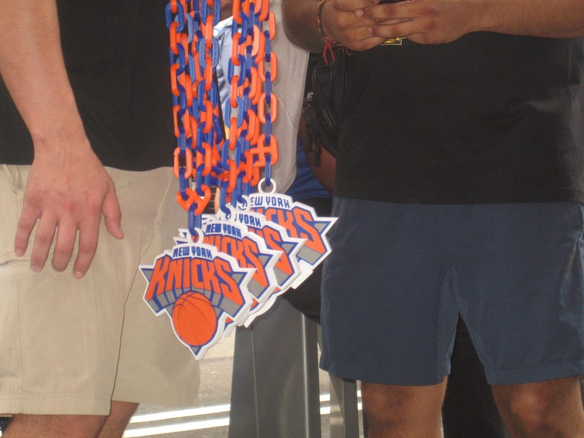
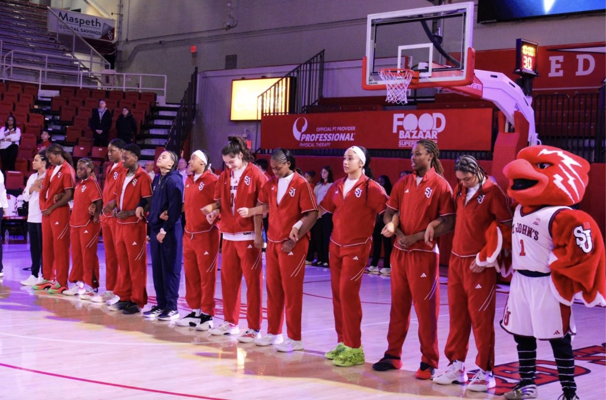
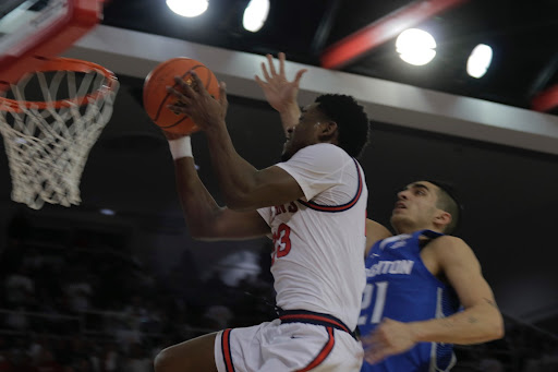
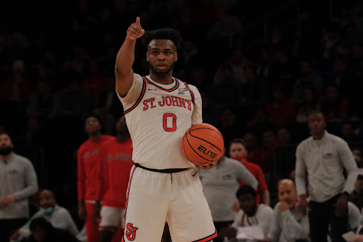
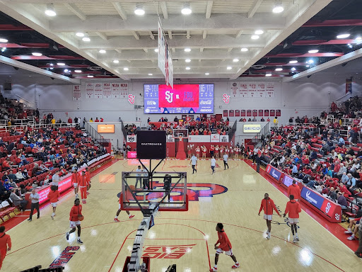
Another aspect of the reworked brand is including athletics within the school’s strategic plan. As detailed on the school’s website, “St. John’s today” includes a point on athletics and “St. John’s tomorrow” includes one on the school being New York City’s team – a phrase used by the basketball program for the past few years.
“Some people might fault you to put in athletics as one of your five brand stories, but it’s part of who we are and I think many good schools now realize that you can be smart and you can be good on the field or on the court,” Sammartino said. “It doesn’t have to be mutually exclusive.”
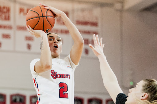
That lack of exclusivity extends to rebranding of athletics as well.
The University sent out a survey days after announcing the changes in June asking faculty, staff, students and alumni about their preferences from logos to names.
The survey mostly focused on the difference between the Red Storm nickname and Johnnies – both of which have been used to describe the teams in recent years.
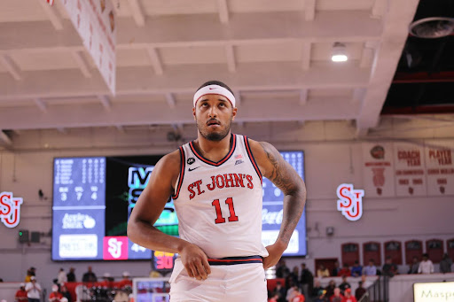
“If we’re going to [rebrand athletics], we need to do it right,” she said. “We can’t keep changing our name, we can’t keep changing our mascot.”
Sammartino thought that the Red Storm name and Johnny Thunderbird mascot – who had also been part of the survey – had “resonated strong” with some people, but not as much with others. She said a lot of people that were spoken to informally before the survey said they didn’t know who the mascot was.
“We really need to get our finger on the pulse on that,” she said.
The idea of rebranding athletics was thrown in after the process had begun for the University’s academic side, she said.
Because of that, there is limited possibility for changes this fall – even involving the current interlocking STJ athletics logo.
The men’s basketball team is wearing new Under Armour jerseys while on tour in Europe that feature red, white and blue.
The uniforms are exclusive for the trip and new jerseys will be unveiled for the regular season.
University spokeswoman Elizabeth Reilly said that the uniforms were not part of the official rebranding process for the University.
Events are planned in the fall to celebrate the changes, according to a statement from Sammartino sent to the University community this summer.
Sammartino said that the University tried to wrap up what makes St. John’s “different,” “stronger,” and “better.”
“It’s really highlighting the good things about St. John’s, the positive things and the things that we think can bring us great students and even better academic students,” she said.
Revised for print edition on August 28, 2013.


Alumni86 • Jul 4, 2013 at 1:29 pm
If you want to compete with Duke, NYU and Georgetown, then raise standards!!!!!
William • Jul 4, 2013 at 2:37 am
I disagree with you about the courses in Theology & Philosophy. I think they are at fundamental core of a liberal art education. The interpretation and practice of Catholic tradition is extremely weird at our school though. While other Catholic (and Vincentian) universities have LGBTQ organizations, we do not. The administration cites it’s not a “Catholic” thing but they are wrong. What a shame!
Robert Recckia • Jul 3, 2013 at 9:33 am
Definitely not a fan of the use of blue in the new logo. Is it too late to get rid of it altogether or at least switch it to black? To me, red & white says “St John’s”. Red, white & blue says “American flag”.
Prof. William Ronalds • Jun 30, 2013 at 2:07 pm
I hesitate to even begin to resurrect this subject, because of the passions and sensitivities of all involved. However, allow me to state unequivocally that there is no way the Indian mascot can be resurrected without offending Native Americans. In the early 1990s, I was chairperson of a committee, composed of faculty, students government reps, and athletes, charged with the impossible task of analyzing the feasibility of saving the “Redmen” name and the Indian-head logo and mascot. We consulted with tribal councils, we suggested the creation of a Native-American Studies institute, we considered scholarships for Native American students, to name a few of the avenues we explored. At a meeting at the Museum of the American Indian, we presented these ideas to tribal elders and Native American scholars. Our full report may be available in University Archives. Suffice it to say that, in the opinion of all concerned, there was no way that an Indian themed mascot could avoid Native American headdresses, which are considered sacred vestments. Further, imagine the mascot’s movements and gestures at an athletic event, without caricaturing ritual dances.
True, the original “Redmen” name arose from the red uniforms. Unfortunately, succeeding decades of use transmogrified the image inevitably, indelibly, and permanently as a caricature of an Indian warrior.
I sympathize with those who long for the return of the mascot, but want to offer assurance that everything possible was done to explore the issue with diligence, dignity, respect, and consideration for all concerned.
Prof. William Ronalds, Department of Art and Design, SJU (retired)
James Hennely • Jun 30, 2013 at 2:02 pm
This is really good. Finally, we got rid of the whole god thing. No more religious Catholic garbage. Lets face it. How many students actually care about god? Happy to see Vincentian staying because we do great service projects. Next thing that needs to go and hopefully it happens soon are the theology and philosophy courses.
Frank Oddo • Jun 27, 2013 at 7:34 pm
Thanks for bringing back our “SJU”!!! Now can we have our Indian mascot back?
Frank Oddo 83' CBA • Jun 27, 2013 at 5:31 pm
Love seeing “SJU” back again! Can we bring back the Indian logo/mascot and come up with a nickname that would not offend Native Americans? Thanks!
Student • Jun 27, 2013 at 2:26 pm
It’s funny how they think changing our image and our name will do something, and they spent a lot of time and money trying to figure out how to change the perception of STJ. The thing is, outsiders ranked STJ as the third best school in NYC behind Columbia and NYU. People of the STJ community rank it much lower. So, our perception problem is internal. Lowering costs, changing faculty, changing how we operate, changing standards, and changing how we execute almost everything will make the most difference in the perception. It will not only change the perception, it will actually make a difference in bettering students’ lives, which is supposed to be the intended goal. You can change everything you want in a school, but what they’re doing is just the surface. They need to change the structure of STJ in order to make a difference.
S Barcia • Aug 29, 2013 at 11:29 am
Unfortunately, you were part of a committee whose aim was not to be correct, but politically correct. I agree with the dropping of images of native Americans on apparel, logos, or team mascots. However, the name Redmen never conjured up these images, and no one today chants “Here we go Redmen” with any thought of conjuring up those images. Most importantly, the name Redmen identified St. john’s for more than it identified native americans. If our name was a tribal name, I’d understand. Syracuse retained the name Orangemen while dropping those images, and today nobody thinks of the former imagery. St. John’s should do the same.
St • Jun 27, 2013 at 1:24 pm
Not a fan of the new logo to be honest.
Charles T • Jun 27, 2013 at 1:10 pm
This is another joke to another ploy by the St. John’s administration to cover up what is really wrong with the school. They need to focus internally not externally, get some facility upgrades like a new library and a new gym with working equipment like every other school in New York.
Changing athletics would further dilute the brand that has been established. STJ to SJU is bland and not that important, but to change colors again will bring further negative criticism. And to once again change nicknames is ridiculous. We obviously can’t bring back the Redmen, but take away Red Storm and the mascot that has seemed to resonate with children and students is not necessary.
I wonder why no one from athletics was quoted? Do you think they have a say in this? Looks like no, good job St. John’s (sarcasm).
Rick • Jun 27, 2013 at 1:08 pm
“If we’re going to [rebrand athletics], we need to do it right,” she said. “We can’t keep changing our name, we can’t keep changing our mascot.” … so we’re changing the name and mascot!
Doesn’t that statement contradict itself?
Unless the school is changing back to Redmen, which unfortunately WILL NEVER HAPPEN. They should keep what they have instead of changing every few years and confusing everyone. I like the current logo. Leave it alone!
Charles T • Jun 27, 2013 at 1:05 pm
Instead of trying to rebrand, maybe they should take an internal look at their Academic programming and facilities. Carnesecca Arena needs reformation, our rec center is a joke with out of date equipment and no AC. If they want to increase the quality of students and academics, that’s internal not external.
I also agree, leave Athletics alone, they are the only department that consistently makes progress with their brand and marketing. Changing back to blue and changing logos is both confusing and not necessary. So is an open-ended survey.
Good job St. John’s, way to continue to not progress, but further alienate people.
Marc • Jun 27, 2013 at 11:39 am
Bring back St. John’s as the Redmen! It IS our name. It had zero Native American connotation upon it’s inception and it is the name that everybody wants back. We were the Redmen because of the color of our uniforms.
Ed Sirianno • Jun 27, 2013 at 9:36 am
Congratulations!
John • Jun 27, 2013 at 9:21 am
“If we’re going to [rebrand athletics], we need to do it right,” she said. “We can’t keep changing our name, we can’t keep changing our mascot.”
So why is it even a thought to change the name? Why change the mascot? Makes no sense.
MLovett • Jun 27, 2013 at 9:13 am
1. Please, no more blue in the logo. Red, white and black is the best color combo for us. We tried blue before, it didn’t go well.
2. The current St. J logo is the best logo we have had in a LOOOOOONG time. No need to change it.
3. The “Red Storm” has been an AWFUL name for us. Seriously, it is really bad.
4. The school needs to get it’s act together because this rebranding every 5 years is getting really old.
5. NO BLUE IN THE UNIFORMS OR LOGO’S!!!!!!
Mark • Jul 2, 2013 at 1:25 pm
I am in total agreement with all of your comments. Wouldn’t however much they paid their brand consultant have been better spent on the students? This is a university, not toothpaste!! It seems unlikely that anyone would change their mind about attending or donating because the logo wasn’t snappy enough.
brianna • Jun 26, 2013 at 9:43 pm
GReat. Maybe time to bring back one of our 3 great fight songs…”Fight for Old St. johns”, “Cheer the Red and White”…only major school without one. Music for both available in University archives…
Andrew • Jun 27, 2013 at 1:47 pm
“Cheer the Red and White” is the same one the Sydney Swans use? Do you have the music for “Fight for Old St John’s?”
Ralph Duthely • Jun 26, 2013 at 9:40 pm
Will the team be called the Red Storm or the Johnnies?
Val • Jun 26, 2013 at 8:40 pm
Great article! Will students abroad see changes in the fall also?
Dr. Richard Ingardia • Jul 2, 2013 at 6:15 pm
Very disappointed in the logo as the focal point that gives meaning to all other aspects in the university is the Catholic Faith. We are first a Catholic university so that a “Christian education perfects the soul” (missing from the logo)is our identity and being. The book, representing The Bible, is missing? Why? Are we blind to our true identity? The discussion of the creation of the new logo does not mention why this university was formed, its special character as a Catholic institution of higher learning, and its aim to search for an understanding of the Faith Catholic.
S Barcia • Aug 29, 2013 at 11:22 am
You are dead on, but obviously more concerned about faith formation of Catholic undergraduate students than the Vincentian leadership is.